Brand Guidelines
Brand Guidelines

These guidelines help you understand our brand. Written in plain English for designers, writers, partners and anyone building with us.
A clear, human promise that anchors every message, interaction and experience.
We help members, clients and providers feel cared for during their healthcare journey. We take on the hard stuff using technology, expertise and real support to help people get better outcomes.
Headlines: Poppins
Aa Bb Cc Dd Ee Ff Gg · 1234567890
Body & subheads: Figtree
Aa Bb Cc Dd Ee Ff Gg · 1234567890
Core brand colors for authority, interaction and clean layout structure.
Supporting accents for warmth, alerts, creative depth and rich backgrounds.
Four traits that shape how we write and how we sound.
Caring
Thoughtful, compassionate, empathetic
Human
Straightforward, relatable, honest
Bold
Confident, active voice, outcome-driven
Knowledgeable
Informed, data-backed, reassuring
Quantum Health is the industry’s leading healthcare navigation company that helps organizations lower healthcare costs by simplifying care journeys and improving outcomes. Serving more than 500 clients and 20+ million members, Quantum Health provides a single point of contact across the entire healthcare journey, combining compassionate support and clinical expertise with advanced technology and predictive AI built on 25+ years of proprietary data.
Through the acquisition and integration of Embold Health’s provider analytics and CirrusMD’s virtual care platform, Quantum Health delivers the industry’s most complete suite of solutions. Members gain immediate on-demand access to physician-led virtual care and patented provider-quality data that guides them to the highest-performing specialists.
Only Quantum Health engages directly with providers to take immediate action at a member’s first moment of need, delivering better outcomes, a superior member experience and more efficient healthcare spending.
To learn more, visit quantum-health.com and connect with us on LinkedIn.
What we promise
These five pillars guide everything we do. They are not abstract values. They are concrete commitments we make to the people we serve.
01 – Sanctuary
We create a safe space. Members can ask questions, share worries and explore options without judgment. Healthcare is stressful — we make it less so.
02 – Expertise
We know healthcare inside and out. Clinical questions, insurance details, provider networks — we have deep knowledge in all of it.
03 – Stick With Them
We don't disappear after one call. We stay with members throughout their entire journey, from first question to final resolution.
04 – Warrior
When systems feel unfair or confusing, we fight for our members. We advocate on their behalf and push back when needed.
05 – Friendship
We build real relationships. Our team gets to know members, often during difficult times, and that connection matters.
How we behave
Values are about actions, not words on a wall. Here is what I CARE means in practice and how we actually show up for each other and for the people we serve.
I am personally responsible
Everyone here contributes to our mission. We don’t wait for someone else to fix problems or take ownership.
Caring
We genuinely care about helping people. It’s not a talking point — it’s why most of us took this job.
Accountable
We do what we say we’ll do. If we make a commitment, we follow through.
Real
We’re honest and direct. We speak with good purpose and act with integrity, even when it’s uncomfortable.
Envelopes
We help stuff ’em. No job is too small when we’re all working toward the same goal. We pitch in wherever needed.
How we come across
Think of personality like describing a coworker. These traits shape how we communicate and how people experience us.
Inspiring
We guide members through difficult moments. They trust us to help them move forward and reach better health. We're steady, encouraging and focused on what's possible.
Compassionate
We genuinely care about people and their families. Empathy is not just something we talk about. We show it through meaningful action at every step.
Relatable
Healthcare can feel isolating. We bring real people and real experiences to every interaction so members feel seen, understood, and supported.
Innovative
We created healthcare navigation. We're not done improving it. We think ahead, use data and technology thoughtfully, and keep pushing for better ways to help.
How we write
Our voice is consistent. It is who we are. Our tone adjusts based on context. A welcome email sounds different than a claim denial explanation, but both sound like Quantum Health.

Caring
Thoughtful, compassionate, empathetic
We exist to support people who need it most. Our writing reflects that commitment. It is warm, considerate and focused on the person.
"We're here to help you figure this out. Let's start with what matters most."
Human
Straightforward, relatable, honest
We focus on the human side of healthcare. No jargon. No corporate speak. Just clear, honest communication.
"This can feel overwhelming. Here's what you need to know right now."
Bold
Confident, active voice, outcome-driven
We created healthcare navigation. We speak with confidence about what we do and what we can accomplish together.
"We'll handle the insurance calls. You focus on getting better."
Knowledgeable
Informed, data-backed, reassuring
We know this space deeply. Our expertise comes through in how we explain things clearly, accurately and in a way that builds trust.
"Based on your plan, you have three options. Here's how each one works."
Our logos
We have a few logo options for different situations. Here's when to use each one.
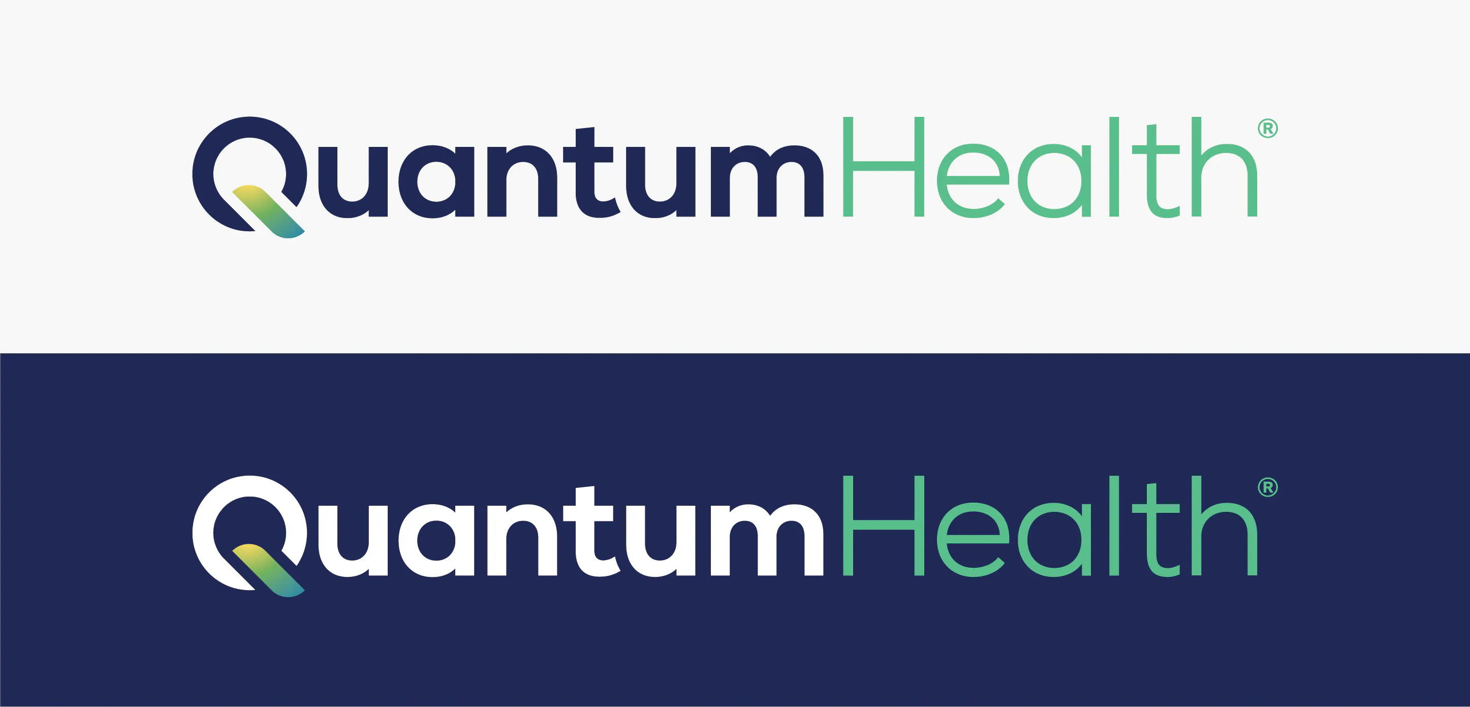
Primary Logo
Use this in most situations. It provides the strongest brand recognition and works well at various sizes.
Best for: Marketing materials, presentations, website header, official documents.
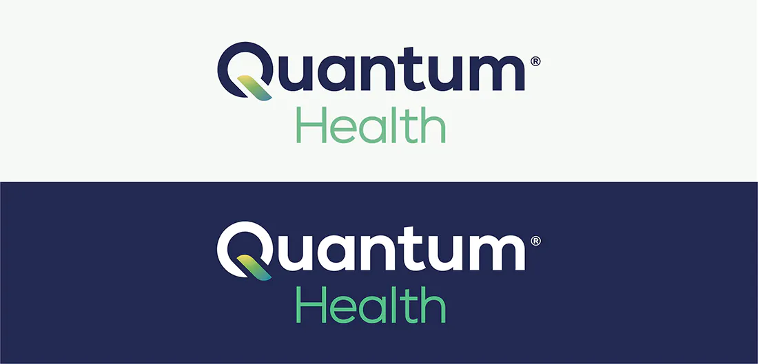
Secondary Logos
Use this when the primary logo does not fit the layout, such as in vertical spaces or when you need a more compact option.
Best for: Social media, narrow layouts, merchandise.

Logo Mark
Use when you need a minimal version of the brand. Only use this where the full logo would be too small to read.
Best for: App icons, social avatars, favicons.
What to avoid
Don't stretch or distort the logo
Don't change the logo colors
Don't add effects like shadows or gradients
Don't place on busy backgrounds where it's hard to read
Our colors
Colors support clarity and trust. Navy grounds us. Blue energizes. Green signals positive outcomes. Use the secondary palette sparingly for variety.
Primary Palette
Primary brand color. Headlines, key elements, backgrounds where we want authority.
Accent color. Links, buttons, interactive elements, supporting graphics.
Success and growth. Positive outcomes, confirmations, wellness-related content.
Background color. Creates breathing room and keeps layouts clean.
Secondary Palette
Warmth and optimism. Highlights, callouts, supporting accents.
Attention and energy. Alerts, important notices, sparingly for emphasis.
Creativity and depth. Secondary accents, variety in larger layouts.
Deep and grounding. Alternative to navy for variety, rich backgrounds.
Our typefaces
We use two typefaces. Poppins is used for headlines. It is bold and friendly. Figtree is used for body text. It is clean and easy to read. Together, they are approachable and professional.
When you call us, you'll talk to a real person who knows healthcare. They'll answer your questions, help you find the right provider, and stay with you until the issue is resolved. That's what navigation means.
Questions?
These guidelines are here to help, not restrict. If something's unclear or you need flexibility, reach out. We're happy to talk through it.